PPOL 5203 Data Science I: Foundations
Data Visualization
Tiago Ventura
Data Visualization
Tiago Ventura
In this Notebook we cover:
- Data Visualization in Theory
- Grammar of Graphics:
plotninematplotlibandseaborn
Summary of this lecture note
As an data scientist, one of the most important skills you need is the ability to make compelling data visualizations to present your work. A well-thought visualization is always more attractive than a crosstab or numerical results from a statistical model.
At our DSPP program, you will do a full semester on Data Visualization. For this reason, here we will cover the basics of visualization in Python, both in theory and in practice, but you will learn more in-depth how to work with animations, build dashboards, among other things in the future.
We will cover Python native libraries for data visualization (matplotlib and seaborn). However, more attention will be given to plotnine, which is a library that brings the grammar of graphics framework to Python. Read more here about plotnine
The grammar of graphics provides a well-structure, layered framework to describe and construct visualization from data. We will focus on the grammar of graphics for the following practical and theorethical reasons:
- it provides a intuitive understand about mapping data to visuals
- the layers allows us to build up the graph in well-define steps
- it integrates will with R visualization capabilities
Setup
import pandas as pd
import numpy as np
import scipy.stats as stats # for calculating the quantiles for a QQ plot
import requests
# Print all columns from the Pandas DataFrame
pd.set_option('display.max_columns', None)
# Ignore warnings from Seaborn (specifically, future update warnings)
import warnings
warnings.filterwarnings("ignore")
Data Visualization in Theory
Let's start with a visualization from my research.
What do you see?
How many variables?
How are these variables represented in the figure?
What are the non-data related information presented in the graph?

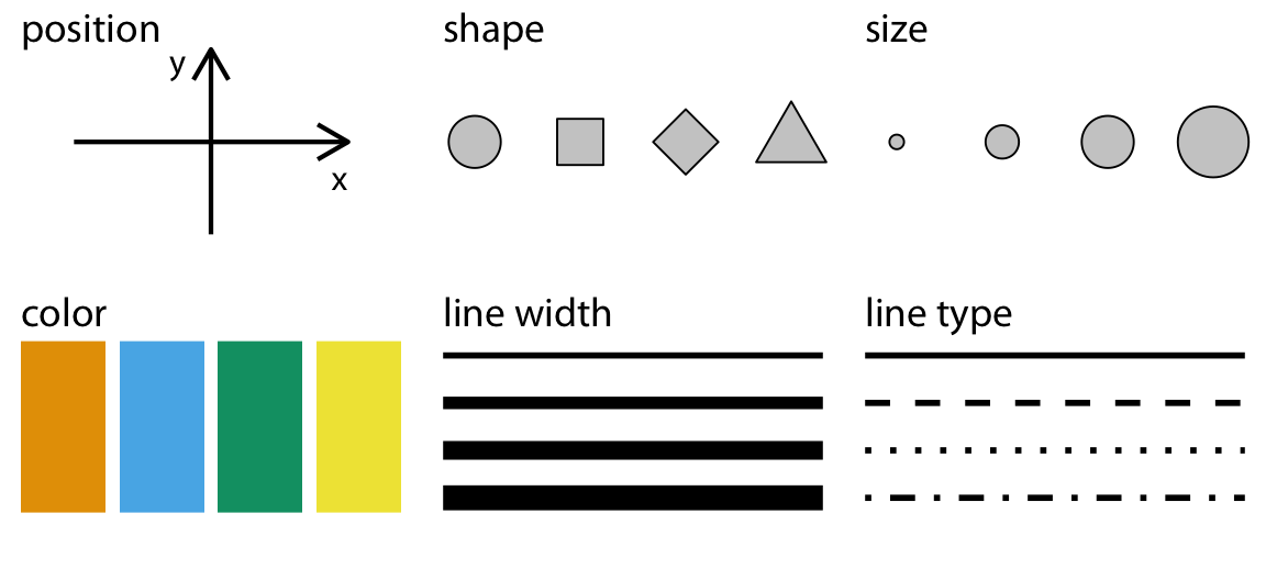
Aesthetics
The key aspect on data visualization is to take data points and convert them visual elements.
All data visualizations map data values into quantifiable features of the resulting graphic. We refer to these features as aesthetics. Fundamentals of Data Visualization, Claus Wilke
Below you can see some commonly used aesthetics in data visualization:
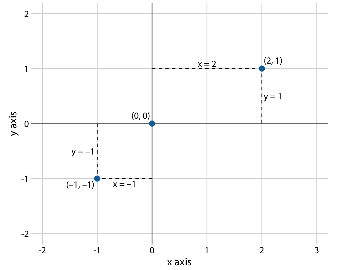
Cartesian coordinates system
Most often we will use a 2d cartesian coordinate system to present our graphs. Humans can very easily understand information in two dimensions, and our work will very often consist on mapping data into X and Y axis.
Adding a 3rd, 4th, 5th variable in a 2d space
However, most often, we want to add more variables to a 2d space. For example, we might want to:
- distinguish discrete items or groups that do not have an intrinsic order
- highlight values that pass a certain threeshold
- Add a sequential data value in the graph
Those are all data points. If we want to represent them in a 2d graph, we need to map them in new aesthetics. Let's show examples with the a few different aesthethics


Grammar of Graphics
According to ChatGPT, a "Grammar is the set of structural rules that dictate how words in a language can be combined to form meaningful sentences. These rules determine how phrases and sentences are constructed in a particular language.""
The grammar of graphics, as the name says, brings a similar effort to establish structural rules to data visualizations. This idea of building a grammar of graphics was first developed by Leland Wilkinson's book "The Grammar of Graphics". The grammar of graphics is about breaking down graphs into these consistent components, allowing for a systematic and structured approach to creating a wide variety of visualizations.
One of the most well-known implementations of the grammar of graphics is the ggplot2 package in the R programming language, developed by Hadley Wickham. ggplot2 breakes the grammar of graphics layer by layer
Native libraries in Python do not use this framework. However, for the reasons explain before, we will focus on this framework in our class, which has been implemented with the library plotnine. plotnine offers an emulator for the powerful ggplot2 graphics package from R
Major Components of the Grammar of Graphics
plotnine/ggplot2 graphs have three key steps
Data Step: The raw data that you want to plot.
Geometries
step : The geometric shapes that will represent the data.Aesthetics <aes()> step: Aesthetics of the geometric and statistical objects, such as position, color, size, shape, and transparency
This all you need to build you graphs. In addition, there are other components you will eventually use to adjust your data visualization
Facets: to produce create subplots based on specific variable
annotations: labels, titles, subtitles, captions.
Coordinates & Scales: some additional functions to adjust aesthetics you are mapping (change colors, size, alpha, scale of x and y coordinates)
Theme: Control the finer presentation details like font size, background color, grid line styles, etc.
In practice: plotnine
Let's first open the gapminder dataset, a subset of the original data set from (http://gapminder.org). For each of 142 countries, it provides values for life expectancy, GDP per capita, and population, every five years, from 1952 to 2007.
import pandas as pd
import numpy as np
from plotnine import * # to imitate ggplot
from gapminder import gapminder # bring data
import warnings
warnings.filterwarnings('ignore') # Ignore warnings
# Read in data
gapminder.head()
# create to new log variables
gapminder = (gapminder
.assign(lngdpPercap = np.log(gapminder["gdpPercap"]),
lnpop = np.log(gapminder["pop"]))
)
# build in plotnine graph
# step 1: data
(ggplot(data=gapminder) +
# step 2: geom
geom_point(
# step 3: aesthethics
aes(x="lngdpPercap", y="lifeExp"))
)

Change the geometric representations
# you can either easily change the geometric representations
# step 1: data
(ggplot(data=gapminder) +
# step 2: geom
#geom_point
geom_smooth(
# step 3: aesthethics
aes(x="lngdpPercap", y="lifeExp"), method='loess')
)

# you can either easily change the geometric representations
# step 1: data
(ggplot(data=gapminder) +
# step 2: geom
geom_smooth(
# step 3: aesthethics
aes(x="lngdpPercap", y="lifeExp"), method="loess") +
# new geometric representation
geom_point(
aes(x="lngdpPercap", y="lifeExp"))
)

# you can either easily change the geometric representations
# step 1: data
(ggplot(data=gapminder) +
# step 2: geom
geom_smooth(
# step 3: aesthethics as variable
aes(x="lngdpPercap", y="lifeExp", color="continent")) +
# aesthetics as values
geom_point(
aes(x="lngdpPercap", y="lifeExp"),
color="black",
alpha=.1,
size=2,
shape="o")
)

# step 1: data
(ggplot(data=gapminder) +
# step 2: geom
geom_point(
# step 3: aesthethics
aes(x="lngdpPercap", y="lifeExp", color="continent"),
alpha=.2, size=3) +
# step scale: manually edit the aesthetics variables
scale_color_manual(values = ["blue","steelblue","black","gold","pink"],
name="Continent") +
# step theme: change the overall layout of the graph
theme_minimal(base_size=16) +
# step facet: break the graph in subplots
facet_wrap("continent", scales="free") +
# step labels: edit the labels of the graph
labs(x="Log GDP Per Capita", y="Life Expectancy", title="Gdp vs Life Expectancy Across the World")
)

<div class="alert alert-block alert-danger", style="font-size: 20px;"> Do I need to memorize all of these options? </div>
No. You need to learn the fundamental steps and how they work. But, you should be asking yourself, what do I do when I need to build a graph?
This is how it works for me:
Consult the plotnine's documentation website for additional guidance and tips on using the API.
Check the library to see graphs you would like to replicate on your work.
And get ready to ask google the same question over and over.
Native Python Libraries: matplotlib + seaborn
Outside plotnine and the integration of grammar of graphics to Python, Python has its own native visualization tools.
The most famous are matplotlib and seaborn (that is actually built based on matplotlib)
Because matplotlib and seaborn are still the most used visualization library in Python, and it is likely you will encounter them as you look through other data scientists' code. Then, we will also cover briefly in class how these libraries work.
We will use the same gapminder data.
Disclaimer: In all honesty, I am a ggplot/plotnine person, so I am not really helpful with matplotlib questions!
matplotlib
Matplotlib has its own way to built plots. In general, it involves:
- step 1: Create the
plt.figure()andplt.axes()objects - step 2: Create the visualization with a specifc method using the
plt.axes()object - step 3: Edit aesthetics with arguments inside of methods
- step 4: Edit labels, titles, and overall annotations
Let's see an example:
# setup
%matplotlib inline
import matplotlib.pyplot as plt # for plotting
import seaborn as sns # for plotting
gapminder.head()
# Matplot lib
# step 1: can be done with `plt.subplots()`
fig, ax = plt.subplots()
# step 2 + step 3
ax.scatter(x = gapminder["lngdpPercap"], y = gapminder["lifeExp"],
c="green", alpha=.5, marker="*")
# step 4
ax.set_ylabel("Log GDP Percapita")
ax.set_xlabel("Life Expectancy")

.plt makes some of these steps unecessary
# Using .plt methods to avoid .axes and .figure
plt.figure(figsize=(8,4))
plt.scatter(x = gapminder["lngdpPercap"], y = gapminder["lifeExp"], c="green", alpha=.5, marker="*")
plt.xlabel("Log GDP perCapita")
plt.ylabel("Life Expectancy")

Seaborn
seaborn is another more traditional Python data visualization library. It is built on top of matplotlib. It offers a higher-level, more attractive interface for creating statistically-informed visualizations.
Main advantages:
- graphs are visually more pleasing than
matplotlib - built-in themes
- integrates seamlessly with pandas DataFrames
Check the seaborn official tutorial
Let's see how it works
# seaborn
sns.scatterplot(x = "lngdpPercap",y="lifeExp",
alpha=.5,
color="green",
s=100,
data = gapminder)
plt.xlabel("Log GDP perCapita")
plt.ylabel("Life Expectancy")

Notice:
- Data comes as an argument
- Variables are masked
- Other than that, very similar to matplotlib
Data types drives visualization decisions
| Data Type | Example | Scale |
|---|---|---|
Numerical | 1.3, 800, 10e3 | Continuous Integer | 1, 2, 3| Discrete (when $n$ is small), Continuous (when $n$ is large) Categorical| "dog", "Nigeria", "A"| Discrete Ordered |"Small", "Medium", "Large"| Discrete Dates/Time | 2009-01-02, 5:32:33 | Continuous
Discrete Values 
Continuous Values 
Relationships 
Discrete Values
Univariate Discrete Categorial Data
Bar Plots
gapminder
# plotnine
(ggplot(gapminder,aes(x='continent')) +
geom_bar())

# Ordering Bar Plot by Frequency
(ggplot(gapminder,aes(x='continent')) +
geom_bar() +
scale_x_discrete(limits=["Africa", "Americas", "Asia", "Europe", "Oceania"]) +
ylim(0, 800) +
theme_minimal()
)

# create a binary indicator for wealthy countries
gapminder = (gapminder.
assign(wealthy=np.where(gapminder["lngdpPercap"] > 9,"yes","no")
)
)
## Adding in more categorical data
(ggplot(gapminder,aes(x='continent',fill='wealthy')) +
geom_bar() +
scale_x_discrete(limits=["Africa", "Americas", "Asia", "Europe", "Oceania"]))

# Dodge + edit colors
(ggplot(gapminder,aes(x='continent',fill='wealthy')) +
geom_bar(position="dodge", color="black") +
scale_x_discrete(limits=["Africa", "Americas", "Asia", "Europe", "Oceania"]) +
scale_fill_manual(values=["yellow", "red"],
limits=["yes", "no"],
labels=["Yes", "No"],
name="Wealthy?")
)

in Seaborn
# Create the bar plot
palette = {"yes": "yellow", "no": "red"}
# Seaborn
palette = {"yes": "yellow", "no": "red"}
sns.catplot(x="continent", hue = "wealthy",
data=gapminder,
kind="count",
palette=palette,
dodge=True,
edgecolor="black")
# Set legend title
plt.legend(title="Wealthy?")

Point + Uncertainty
# plotnine
# Calculate the means and standard errors for lifeExp grouped by continent
grouped = gapminder.groupby('continent')['lifeExp'].agg(['mean', 'std']).reset_index()
grouped['ymin'] = grouped['mean'] - grouped['std']
grouped['ymax'] = grouped['mean'] + grouped['std']
# Plot
(ggplot(grouped, aes(x='continent', y='mean'))
+ geom_point(color="red", size=3)
+ geom_errorbar(aes( ymin='ymin', ymax='ymax'), width=.2, size=1.2)
)

# seaborn catplot method
sns.catplot(x="continent",
y="lifeExp",
data=gapminder,
kind="point",
join=False) # discuss the difference between join=True, and join=False

# plotnine
(ggplot(gapminder,aes(x='continent',y = 'lifeExp')) +
geom_boxplot() +
coord_flip())

# Seaborn
sns.boxplot(y='continent',x = 'lifeExp',data=gapminder)

Violin Plot
# ggplot
(ggplot(gapminder,aes(x='continent',y = 'lifeExp')) +
geom_violin())

# Seaborn
sns.violinplot(x='continent',y = 'lifeExp',data=gapminder)

jitter plot
(ggplot(gapminder,aes(x='continent',y = 'lifeExp',color="continent")) +
geom_jitter(width = .25,alpha=.5,show_legend=False))

# Layer the representations
(ggplot(gapminder,aes(x='continent',y = 'lifeExp',color="continent")) +
geom_jitter(width = .1,alpha=.1,show_legend=False) +
geom_boxplot(alpha=.5,show_legend=False))

# Seaborn
color = {"Asia": "blue",
"Europe": "red",
"Africa": "yellow",
"Americas":"green",
"Oceania":"gray"}
# boxplot
sns.boxplot(x='continent',y = 'lifeExp',
hue="continent",
palette=color,
data=gapminder)
# jitter
sns.stripplot(x='continent', y='lifeExp',
data=gapminder, jitter=True,
alpha=0.1, hue="continent",
palette=color)
plt.legend([], [], frameon=False)

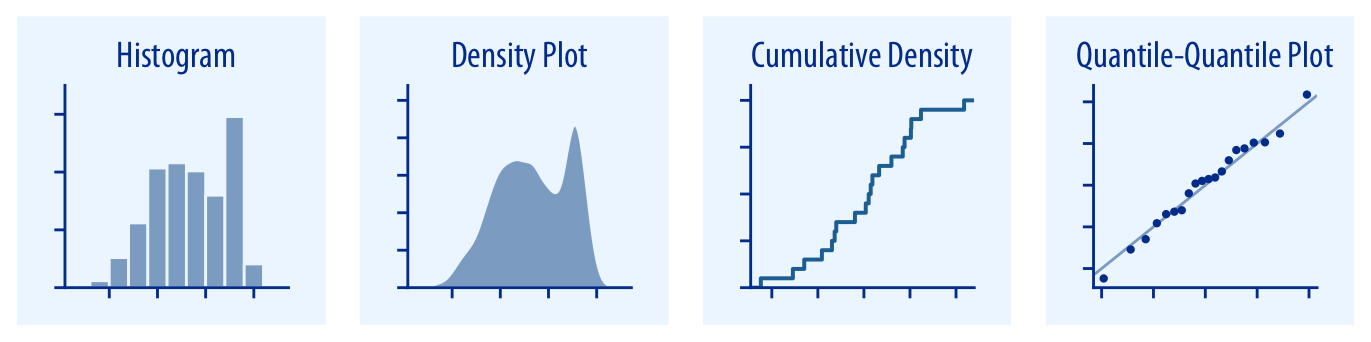
Continuous Values
Univariate Continuos
Histogram
# plotnine/ggplot2
(ggplot(gapminder, aes(x = 'lifeExp')) +
geom_histogram(bins=100))

# Seaborn
sns.distplot(gapminder.lifeExp,hist=True,kde=True)

Density
# plotnine/ggplot2
(ggplot(gapminder, aes(x = 'lifeExp')) +
geom_density(fill="blue",color="black",alpha=.5)+
xlim(0,100))

Multiple Plots
# plotnine/ggplot2
(ggplot(gapminder, aes(x = 'lifeExp', fill="continent")) +
geom_density(color="black",alpha=.5)+
xlim(0,100) +
facet_grid(" ~ continent"))

# Seaborn
sns.kdeplot(gapminder.lifeExp,shade=True)

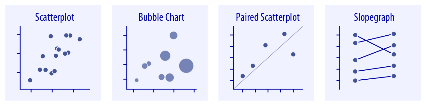
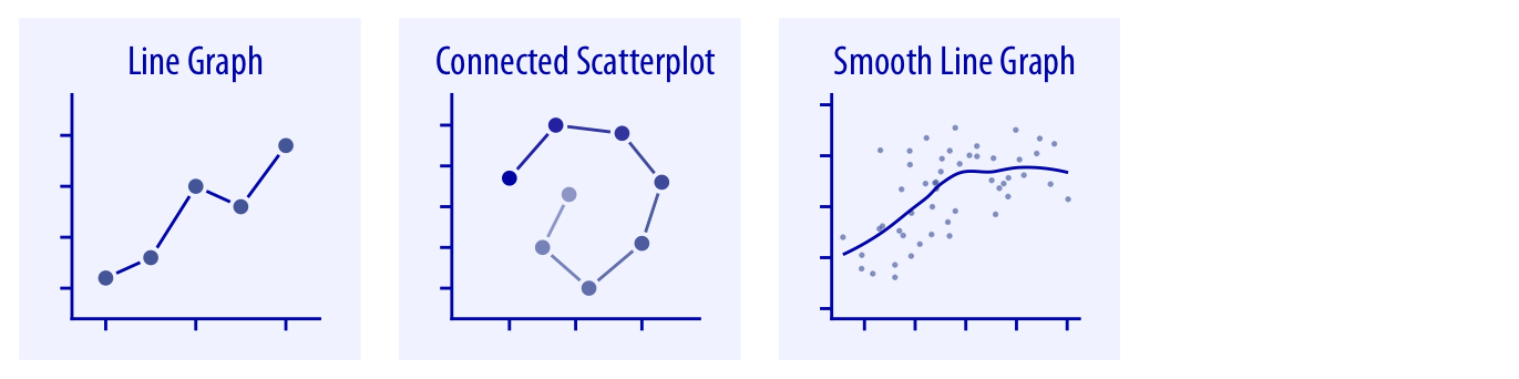
Relationships 
Bivariate Continuous
scatterplot
# plotnine/ggplot2
(ggplot(gapminder, aes(x = 'lngdpPercap', y = 'lifeExp')) +
geom_point(alpha=.5))

# Seaborn
sns.scatterplot(x = 'lngdpPercap', y = 'lifeExp',data=gapminder)

lineplot
# plotnine/ggplot2
(ggplot(gapminder, aes(x = 'lngdpPercap', y = 'lifeExp')) +
geom_line())

# easily smooth in ggplot
(ggplot(gapminder, aes(x = 'lngdpPercap', y = 'lifeExp')) +
geom_point(alpha=.2)
+ geom_smooth(method="loess"))

# Seaborn
sns.lineplot(x = 'lngdpPercap', y = 'lifeExp',data=gapminder)

Practice
Try your best to reproduce the figure below. I generated a random sample of data for you to use. Enjoy!

# data generation
import numpy as np
import pandas as pd
from plotnine import ggplot, aes, geom_point, geom_smooth, theme_minimal, scale_color_manual, labs, geom_vline
# Simulation
np.random.seed(42) # For reproducibility
n = 300
margin = np.random.uniform(-1, 1, n) # Margin between -1 and 1
party = np.where(margin < 0, 'Non-Incumbent', 'Incumbent')
party_ = np.where(margin < 0, 1, 0)
# the model
vote_share = 0.2 * margin - .2 *party_ + np.random.normal(0, 0.2, n)*abs(margin) # Linear relationship with some noise
# Build a dataframe
df = pd.DataFrame({
'margin': margin,
'vote_share': vote_share,
'party': party
})
# build your plot
df
# Plot using plotnine
plot = (
ggplot(df, aes(x='margin', y='vote_share', color='party', alpha= 1 - np.abs(df.margin))) +
geom_point() + # Plot points with transparency
geom_smooth(method='loess', color='gray', se=True) + # Add smooth curve with confidence interval
geom_vline(xintercept=0, linetype='dotted', color='black') + # Add vertical dotted line at zero
scale_color_manual(values={'Non-Incumbent': 'blue', 'Incumbent': 'red'}) + # Set colors manually
labs(
x='Margin (Results within the optimal bandwidth)',
y='Vote Share for the House Elections'
) +
theme_minimal()
)
# Show the plot
print(plot)
!jupyter nbconvert _week-6-data-visualization.ipynb --to html --template classic