PPOL 5203 - Data Science I: Foundations
Week 7: Tidying, Joining and Visualizing Data
Grouped Operations in Pandas
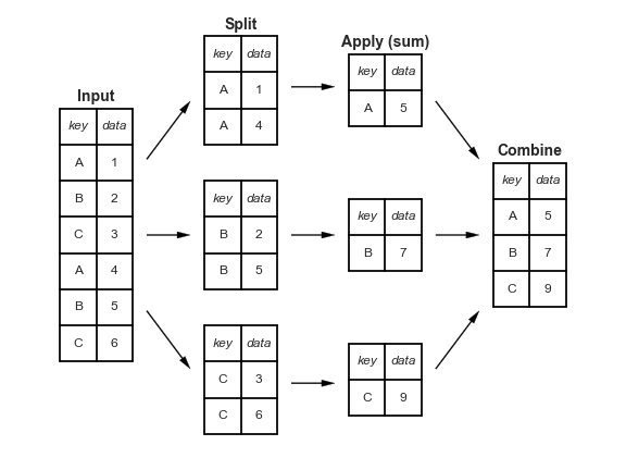
From Python Data Science Handbook by Jake VanderPlas
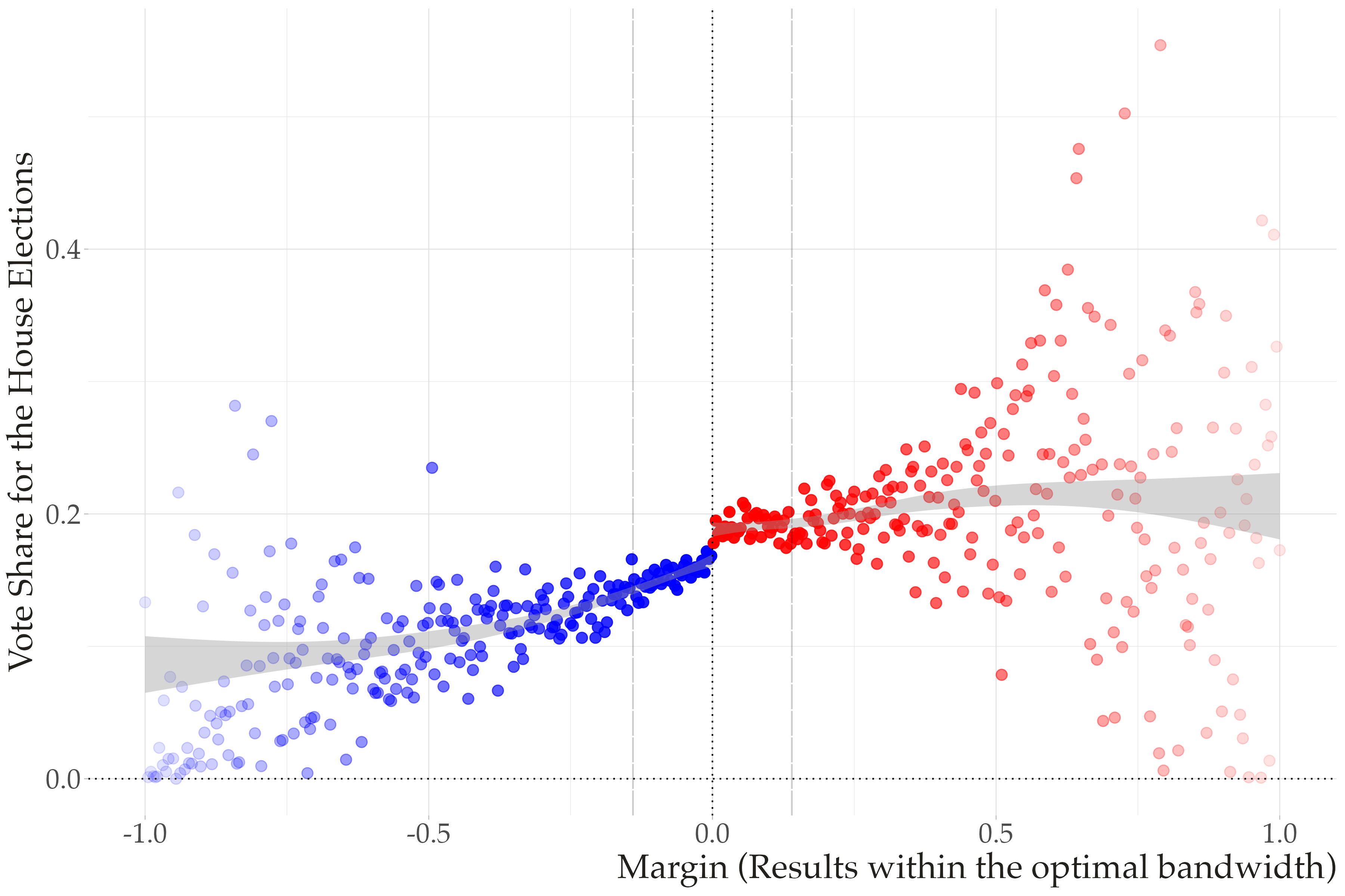
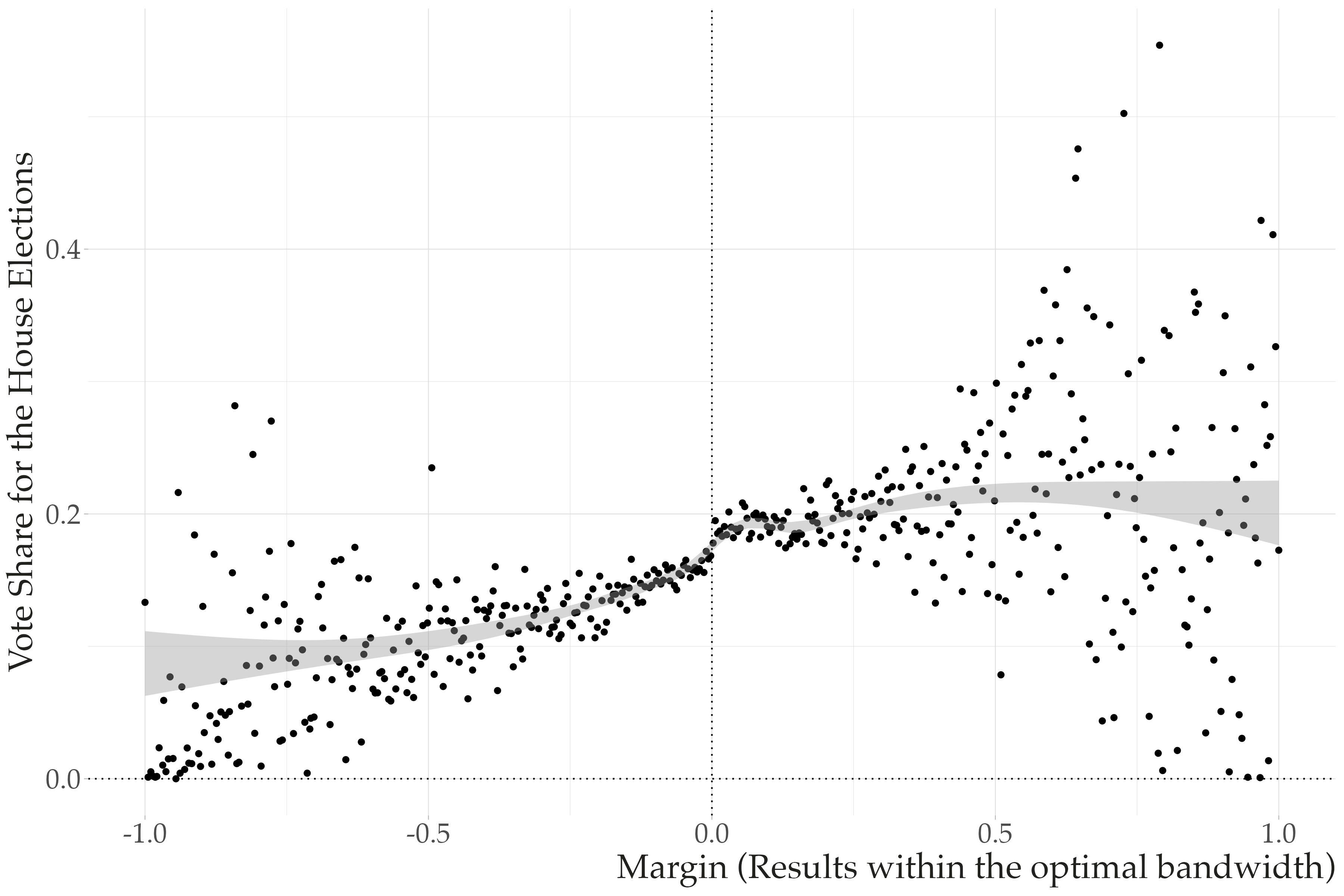
Quizz: What do you see?

How many variables (data) are mapped in this graph?
How are these variables (non-constant) represented in the figure?
What are the non-data (constant) related information presented in the graph?
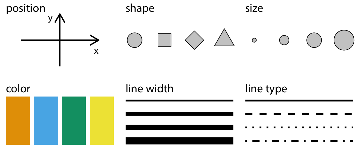
Aesthetics
All data visualizations map data values into quantifiable features of the resulting graphic. We refer to these features as aesthetics. Fundamentals of Data Visualization, Claus Wilke
Aesthetics: visual mappings that connect data variables to visual attributes of graphical elements
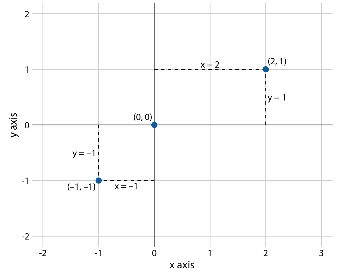
Cartesian coordinates system: 2d
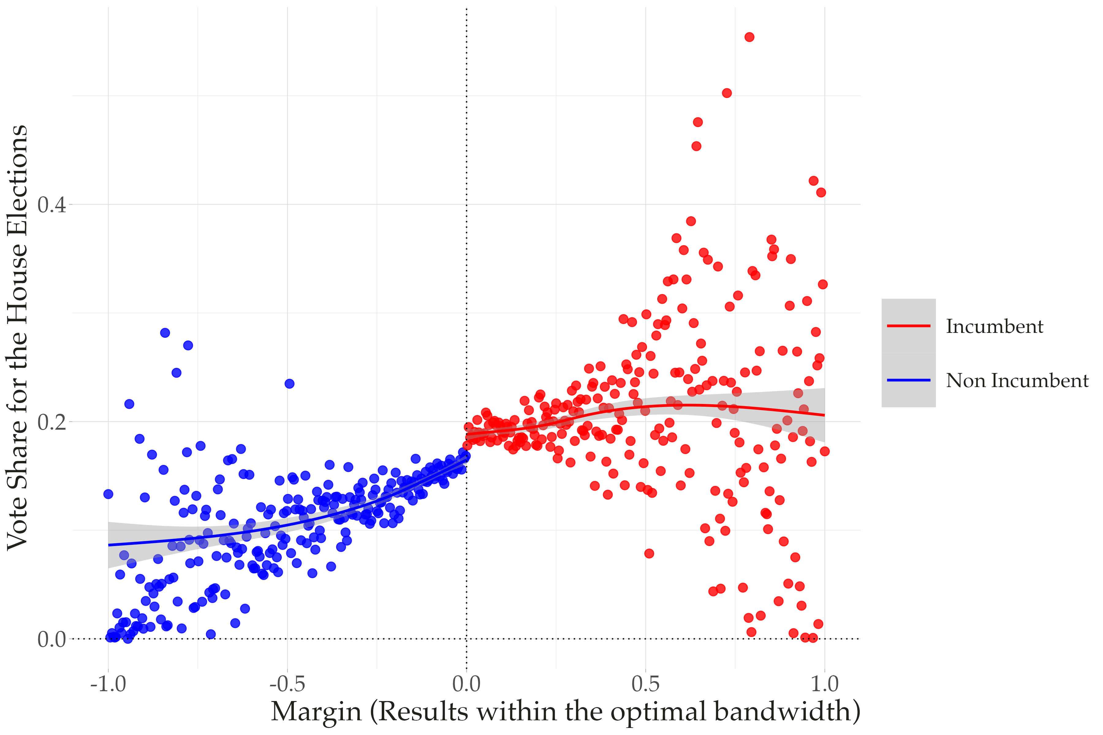
More dimensions
We often want map more variables into the graph. We do this exploring new aesthetics.
Color Aesthetics to Distinguish
To represent visually a sequence of data points